

It’s finally time to talk about the redesign of my website! If you haven’t stopped by in a while (or ever), things are looking a little different over here. Since 2017, my site has gone though a revamp or two…or three. Back at the start, it had one purpose: blog posts. I was taking a production class at the time, and the professor wanted us to write about our process. We were working on games in small teams, and every week we’d set new goals and face new challenges. By the end of each week we’d write and reflect on how it all went. I’ve always loved writing, and honestly, this was one of my favorite parts of production. I found that reflecting back on my work taught me a lot about how to move forward. I mean, I’m still blogging now. So I guess something really clicked!
Back then, the site was just a place to publish the posts. And so the design of the thing wasn’t really my focus. As long as the blog was accessible and readable, the site was good enough. Since it was blog-focused, I decided to use WordPress as a platform/host. It did its job then and, for better or worse, is still what I use today. So I selected one of the preset themes and published away! The next year, I got much more serious about my career, and I realized my website needed to be more. It couldn’t just be a regular blog anymore; I really needed an online portfolio. That’s when I kicked off my first redesign!
Redesign #1
There was slightly less designing going on with this first revamp. Honestly, I was just pickier about which WordPress theme I used! That being said, I still had a vision. I had already created some print materials a month earlier. They shared an aesthetic, one that would be the start of my own personal brand-building!

This old resume, cover letter, and business card have a few things in common. There’s a blue and white color scheme, and a fun diegetic paper/stationary aesthetic. You have the resume, which is meant to look like a sketchbook. And you have the business card, which is a little sheet of animation paper. Some of this might look familiar! At the time, I really wanted my website to share some of this too. But the technical limitations of WordPress (and mostly the technical limitations of 2018 Nick) couldn’t quite manage that. So instead, I borrowed the color scheme and left the rest behind.

Unfortunately, this is the only screenshot I have of the old website. Absolutely a lesson learned in archiving! As I mentioned before, I added some of the most basic elements of the brand (the blue and white) to the site. Here you can see the landing page, which featured my old animation reel, a brief about me, and links to my socials. The sandwich menu on the top right had links to my blog and portfolio pages (containing a gallery of animations). Simple and clean! There was still a lot of work missing, like my illustrations and graphic designs. I wanted to focus purely on animation at the time. I also didn’t quite feel as confident about sharing that other stuff. Eventually I would, and that’s when my site needed another upgrade. Cue redesign number 2!
Redesign #2
It’s super important to note that this second redesign didn’t happen until five years later. Immediately after graduating college in 2018, I experienced very intense burn-out. Leading up to graduation, I had spent a LOT of my personal and professional time working on art and animation. I was so set on finding new work and establishing myself post-grad, that I was burning the candle at both ends. And of course…this had a cost. For the remainder of the year, I barely touched art at all, except when I had to. But by early 2019, after a lot of healing and some time away from art, I jumped back in. I was feeling ready and inspired. I spent the next few years working on my animation, illustration, and design skills, finding freelance work where I could. By 2023, I finally felt that I had plenty of work to share. I also really wanted to re-start my blog. But to do all that, I needed more space. So I gave my website a little revamp.

Once again, this is the only screenshot I have of this version. Unfortunately it’s not even the home page (it’s the illustration page). Oops! I ended up simplifying a lot of the visuals here. I got rid of the large margins and replaced the header with a gradient. The color scheme is basically the same, so there’s still some cohesion with the print materials I showed earlier. Layout-wise, I ditched the sandwich menu (except on mobile) and replaced it with a navigation bar. I split the home and about pages, changed the “work” page to animation, and added an illustration page. Not a huge change overall, but enough to mention. In hindsight, I don’t feel it was really necessary to separate the home and about pages. There was some redundant information on both, and it just added more noise to the navbar. Don’t worry, I’ll address this later.
Overall, I think this little revamp fit the moment! With the blog making a comeback and some fresh social media posts drawing in new folks, it felt like enough. But even with the new look, something was still off. A graphic design page was a must! Since the last redesign, I’d been working hard on my graphic design skills, and I really needed a place to showcase that work. Plus, I wanted to add a pinch more personality to the site. Don’t get me wrong, the current setup was neat and functional, but for a personal site, I wanted it to feel a bit more me. So, time for redesign number 3!
Redesign #3
First and foremost, one of the main goals of this redesign was to sort my art into neat and clear pages. Each page would show off one of my main artistic skills: graphic design, animation, illustration, and writing. I also wanted to tackle that earlier problem about the home page vs. the about me page, so I combined them into one. This home page would also connect all four areas of art and link to their own pages. Another big goal was to make this portfolio website feel like an “internet sketchbook,” both in how it looks, and what it showcases. I wanted most parts of the site to feel like they belonged in a sketchbook, with items and headings looking like they’ve been taped down, stuck on like sticky notes, or look like other stationery. To keep with that theme, I thought it’d be fun to scatter some little background sketch elements around the site; Things like illustrations, grids, symbols, dotted lines, and so on. As you can probably tell, this was entirely inspired by the print materials I created back in 2018.
With those ideas in mind, I jumped right in! First up, I had to nail down a few “brand essentials.” What colors am I using? What fonts? Just the basics to get me started. Let’s take a look at color. I wanted to keep things super simple. Three main brand colors, but the whole palette would be complementary. I decided to stick with a similar blue as before, then pair it with a fun orange. The white of the page would have a warm, slightly orange tint too. I also needed to figure out how exactly these colors should play together. Here’s a breakdown:


Next I needed fonts! I wanted something for the header and subheader that could be very blocky and bold without being too intense. I ended up finding Figtree, a sans-serif geometric font by Erik Kennedy. This fit the bill! To contrast with the geometric sans, my body text would use Newsreader. It’s a super clear and readable serif font, great for this pairing. Here they both are in action:

Now that I had established some critical brand basics, it was finally time to figure out the rest. After doing some quick sketches of the layout, I hopped into Figma to create some vector thumbnails. I started with the homepage. Like I said before, I wanted a page that tied everything together. This is what I came up with:

Then there’s the new graphic design page. I wanted to keep it super simple. It has a gallery of project thumbnails, and each one takes you straight to its own project sub-page. Those pages show off each project and give you a little background on how it all came together. Plus, each project page would link you to its neighbors on the grid.

Then we have the animation and illustration pages. The illustration page is a real simple masonry gallery, while the animation page has a wee bit more to it. Since I have both 3D and 2D animations, I decided to include a tab for each style. In the 3D tab, my demo reel would take center stage. I’d also have videos for each animation in a grid below it. In keeping with the intended aesthetic, these sections are styled like manila folders.

Luckily, I didn’t have to spend too much time sketching for the blog page, since WordPress already has a built in layout for that. Once I wrapped up those thumbnails and got some feedback, I jumped into building the site! I ended up switching to WordPress’ Creatio theme this time, but it was just a starting point. I planned to modify it quite a bit.
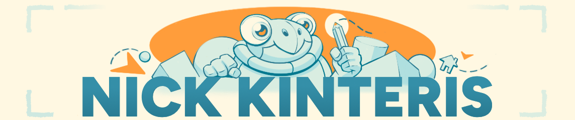
I started things off with the header and footer since those would stay the same on every page, giving the site its overall look. The header and footer together make up our “sketchbook,” with a spiral binding on top and stacked pages at the bottom. I’ve got a few other fun graphics scattered around the site, but we’ll get to those later. For now, let’s talk about the header title and navbar. Since it’s my personal site, I wanted my name to stand out. I imagined big, bold letters with an illustration to grab the viewer’s attention. I spent a good chunk of time figuring out what that illustration should be. It had to mix all my main artistic skills in one image: a character for animation, a pencil for illustration and writing, plus some shapes and lines to represent graphic design. Here’s a little timelapse of the sketch:
The navbar under the header title links to all my pages, and also acts like a subheading showing off my skills. I also wanted to make things a bit interactive! When you hover over each item, you get some tiny feedback. The illustration animates and the navbar items light up. Plus, if you’re on a page, that specific navigation item stays highlighted. I’ve sprinkled a bunch of these little interactions all over the site using CSS. WordPress has a few ways to edit CSS, and I ended up using their additional CSS/classes method. I picked up CSS and HTML back in college, so it was fun to dive back into those skills.
Now, about those graphic elements I mentioned earlier. I went ahead and created a whole set! There’s a sketchbook, and ALSO scraps of paper, clipboards, folders, and more. I planned to sprinkle these throughout the site to really enhance that sketchbook feel. Here’s a little collection of them:

To connect back to the header illustration, I really wanted some little sketches sprinkled throughout the site. I needed them to feel cohesive, so I made sure they all had some geometric bits in common. The main sketch I created is right on the homepage, part of the welcome/about me section. Just like the header, I included elements that show off my different skills. Check out this timelapse of that sketch:
Like I said before, I wanted to emphasize feedback and interactivity. If you hover over the illustrations, they’ll transform a bit! Here’s a little breakdown of those elements:

With all these elements combined, the site finally started to come together! Like I mentioned earlier, I tried to sneak in as much subtle interactivity as possible using CSS. Most buttons give some feedback on hover, whether it’s expanding a bit or changing color. You’ll see this all over the site. I mapped out the page flow too, so you can hop between relevant pages fairly quickly. There are a few areas, like the animation page, that I wish worked a bit differently though. The 3D and 2D options look like tabs you can switch between, but they’re actually separate pages, and that’s super obvious when they load in.
Speaking of which, I ran into some hiccups while working with WordPress themes. Some parts of a theme’s code just can’t be overwritten with additional CSS. For example, I wrote some CSS to have an image overlay another image on hover, which modified how WordPress’ built-in cover image block worked. I used it for the interactive illustrations, including the header title. It worked like a charm, except for one little issue. If I made the overlaid image a linked image, the theme would automatically shrink the second image by a pixel or two. So when you hovered over it, it just suddenly shrunk. I used this for the header title image (since it also links to the homepage) and so it drove me a bit nuts. I tried everything to fix it but couldn’t find a solution. The extremely quick fix was to slightly scale up the second image on hover, which caused some minor jitter. Not perfect, but it would have to do!
Even with these technical hiccups, I was able to get most of the functionality I wanted! I’m sure there are faster and better ways to do a lot of this, but you’ve got to judge your work based on your current skill. After all, I’ve still got a lot to learn about UX and graphic design. But I put in my best effort in the moment, and I learned a ton along the way. And now my new site aligns more closely with my vision, and I call that a win!
No doubt that as my design skills improve, I’ll revamp the site again. I mean, I can already spot areas for improvement! But for now, this is my site! Welcome, and please take a look around!
Okay, that’s all for now! Thanks a ton for sticking around to read this! I know it was a bit of a long one, so I really appreciate you hanging in there. See you next month!
My Links: ArtStation / Cara / Vimeo / YouTube / Instagram

Leave a Reply to NickCancel reply